
January 15, 2017
“How do I know when the flavor of my beer is out of spec?”
I get this question a lot, and it truly is a fundamental question if your goal is to consistently brew great beer. Because of this, breweries need an easy AND objective way to tell if a given batch hits the flavor profile expected. This type of test has many names (e.g. go/no go, true to brand, TTB, etc.) and there are many approaches, all detailed below, but none so easy and powerful as using percent defect charts (p-charts for short).
Here’s what you’ll learn from this post:
- The different approaches of how to measure batch-to-batch variation
- Why we recommend p-charts
- An easy to understand guide with expert tips for using p-charts in your brewery
Approach 1: The easy, but not reliable route of using a quality scale for batch release
Many breweries apply a “quality scale” where an arbitrary flavor and quality range is set to determine what is acceptable and non-acceptable. Here’s how it works in practice. Your panel is given a baseline description, tastes the batch, and scores acceptability on a scale of X-Y, with “X” being least acceptable and “Y” being most acceptable. You take the scores and average them and if the average hits in the predetermined range of “good quality,” then the batch is released. Accordingly, if the average quality score is within the range of “bad quality” then an action must be taken. The arbitrary nature of such a scale is tough for me to swallow and I’ve found that most averages skirt the line between acceptable and not acceptable, basically simplifying the measurement to the binary 0’s and 1’s or “Go/No Go.” Super easy yes, but far from a best practice.
Approach 2: The labor intensive, and not quite logical flavor scaling approach
The sensory statistics knowledge gained in my academic training was primarily based on the application of advanced techniques like Quantitative Descriptive Analysis (hey, no drifting off, this is important!). Here’s the deal with QDA, you’ve got to use crazy complex multivariate data analysis techniques to decode mountains of attribute scaling data. So not only do you need to collect the data, sift through it and clean it up, then you have to basically have a degree in stats to even do anything with the information. Even then it isn’t clear to me how one would use such data to be sure that batch-to-batch variation was within the normal limits of the production facility. What does it mean if one attribute is scaled higher than usual? Is this something worthy of a reaction? My brewing courses outlined the use of control charts to set targets and ranges for various analytical specs like ABV and IBU (5.2+0.2% ABV); but there was no easy way to simply determine if the flavor (arguably the most important spec to hit) of the beer was within an acceptable range of variation. So sure, you can scale attributes, but you’ll likely be wasting precious time if your goal is to determine if a batch is true to the brand profile.
Approach 3: Reliable and elegantly simple statistics
P-Charting is a technique that has been applied in the quality assurance industry for over 30 years1 but has seldom (strangely) seen much use in brewery sensory programs. The term p-charting stands for percent defect charting - or probability charting, depending on who you ask - and was widely popularized by Six Sigma, but in the broader quality assurance world, these charts are referred to as X-bar charts (they are the same thing but we will refer to them as p-charts). I got the inside scoop on p-charts when I started working for Lauren Salazar at New Belgium Brewing Company in 2010. Lauren was frustrated with the lack of brand variation testing and used that frustration to pioneer p-charting in the brewing industry. I’ve since come to realize how appropriate and useful this technique can be when used to analyze sensory data! These charts provide a powerful, yet, simple and elegant way of determining adherence to the brand’s target flavor profile while giving valid indication of process anomalies that influence the beer’s final flavor profile. The beauty is that p-charts allow for some variation within the product (beer is a fermentation after all!), while maintaining rigorous, yet practical standards.
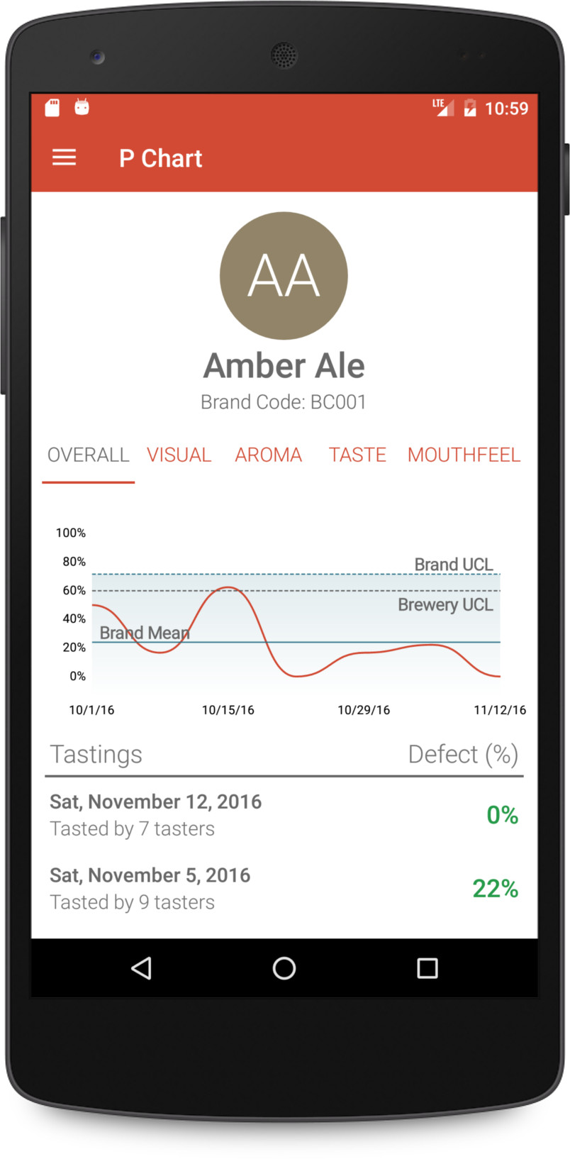
Bottom line: you should be using p-charts and we have your back. Let’s demystify the different parts of a sensory p-chart.
- Completed panel data: represented by dots, each dot represents the average number of panelists who selected “Not TTB” for a specific modality.
- Mean or Center Line (CL): pretty straightforward, this is the middle line and it represents the average total percent defect. This is the average number of panelists that typically select “Not TTB.” It’s position is dynamic, meaning it will change slightly whenever new data is added (e.g. any time you have your panel complete a tasting).
- Upper Control Limit (UCL): this is the top line, representing the highest you can go, in terms of variability within a batch, for it to still be considered true to the brand profile/description. It too is dynamic. For example, if you are making variable product as part of your normal process, the UCL will be quite large, but if your process is tight and you are making consistent beer, the UCL will be quite low. The UCL is the sum of the average percent defect, or the average number of validated panelists selecting “Not True to Brand,” and three times the standard deviation of the mean.
- Lower Control Limit (LCL): this is the bottom line, and it is always zero. This makes sense as you could never have a negative number of assessments.
Now that we know the parts, you can collect and calculate the limits on your own based on the definitions above, or you can let DraughtLab Pro p-charts do the work for you (see steps below). Either way, good on ya, this is the best practice for True to Brand testing.
Complete descriptive test for the brand. You’ll need this baseline description before you can test for batch to batch variation in the True to Brand test.
-
Set up and have your panel complete True to Brand test.
Expert Tip: We recommend a minimum of 10 panelists per test to ensure your data has statistical meaning. For example, if you only have two panelists and one says the sample is not true to brand that sets your average percent defect to 50%! Don’t forget, DraughtLab Pro makes is easy to invite people to a tasting (think beyond brewing staff to taproom bartenders, trusted and loyal customers, buddies from another brewery) so there’s no excuse for not hitting your numbers.
-
You’ll need to rack up 10 True to Brand Tests to get your p-chart’s CL and UCL established.
Expert Tip: You may be thinking that it could take you a very long time to build your charts with ten independent samples of the same beer – FEAR NOT! – this is where the “All Brands” chart option comes into play. The All Brands chart encompasses all of the samples evaluated by the panel thus allowing you to see a broad view of how your brewery’s process looks as a whole (not just per brand). It is absolutely permissible to use your All Brands chart as the benchmark while building each of the charts for your individual brands. In DraughtLab Pro, we show you where each sample lies on both the individual brand and all brands charts. When using this option, it is up to the panel administrator to make the final call based on where the sample lies in the chart and the comments that are associated with the sample during testing. Then once you have 10 tests for a particular brand, you can use the individual p-chart from there.
Note: These charts take into account all of your historical data so the samples must be independent in that they must be different batches. If you build your charts on multiple assessments of the same batch of beer you skew your data and the charts will not be based on the normal variation representative of your process.
- Any sample that falls outside of the UCL is known to be out of the range of normal variation for your process, in that there were more panelists than normal saying that the sample is “Not TTB,” meaning that the beer is not true to its baseline description/brand profile. And that’s it. In DraughtLab Pro, all the data collection is digital and the calculations are on the back end, making this sensory test a breeze so you can get back to doing the millions other things you need to do to make your brewery the best it can be. And we can all cheers to that!
1. Nelson, L. 1984. The Shewart control chart-tests for special causes. Journal of Quality Technology, 16, 237-239.
